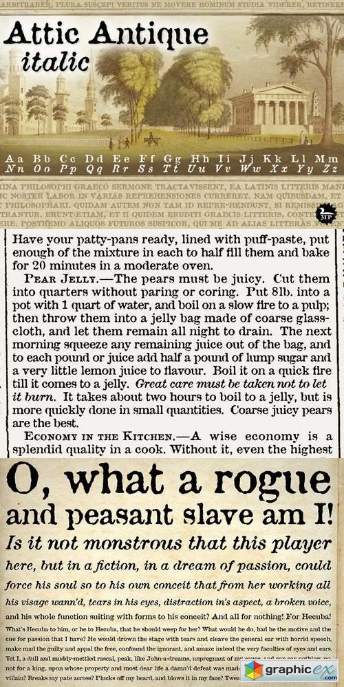
Attic Antique Font Family
Flipping through a friend’s old book of John Burroughs nature essays many years ago, I thought it’d be fun to see if I could create a typeface with the same uneven, imperfect look to it. I picked and chose among various printed characters, enlarged them somewhat with an old photocopier, then hand-rendered each digitized glyph into roman and italic styles. The result: a surprisingly legible “grunge” serif that’s become one of our most-used fonts. Attic Antique shares the wide spacing and ample serifs of the Century faces, but with the worn, decayed look of the text in an-old library book. Use it to represent age, to suggest photocopied archives, or to convey a general feeling of old-bookishness.